


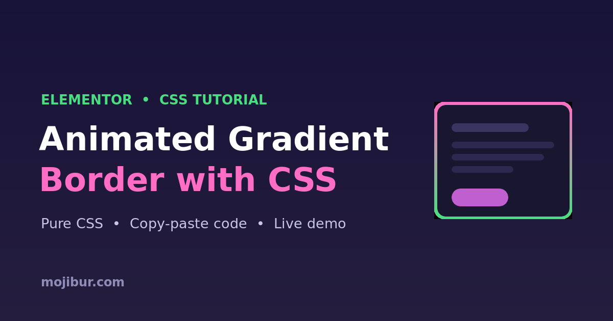
Want your Elementor cards, buttons, or sections to really grab attention? An animated gradient border is one of the cleanest ways to do it — a glowing, rotating color edge that runs on pure CSS, with no plugin and no JavaScript. In this tutorial you’ll get the full code, a live demo, and the exact steps to add it in Elementor.
What you’ll build
A box with a continuously moving gradient border that cycles through colors. It works on any Elementor container, button, or image box, it’s fully responsive, and it’s lightweight because the animation runs on the GPU.
Live demo
Animated Gradient Border
Pure CSS, no plugin, no JavaScript. Always-on glow that works anywhere in Elementor.
Step 1 — Add an Elementor container
Drag a Container onto your page and drop whatever content you like inside it — a heading, an icon box, or a button. Give it some padding so the border has room to breathe.
Step 2 — Give it a CSS class
Select the container, open Advanced → CSS Classes, and add the class below:
mgb-card
Step 3 — Paste the CSS
Add this under the element’s Advanced → Custom CSS tab (Elementor Pro), or site-wide in Elementor → Site Settings → Custom CSS. If you use the per-element box, replace .mgb-card with selector.
					.mgb-card{
  position: relative;
  border-radius: 18px;
  background: #141225;   /* inner background */
  z-index: 0;
}

/* the moving gradient sits behind the card */
.mgb-card::before{
  content: "";
  position: absolute;
  inset: -3px;                 /* border thickness */
  border-radius: 20px;
  background: linear-gradient(60deg,#ff6ec4,#7873f5,#4ade80,#ff6ec4);
  background-size: 300% 300%;
  z-index: -1;
  animation: mgb-move 4s linear infinite;
}

/* covers the middle so only the edge shows */
.mgb-card::after{
  content: "";
  position: absolute;
  inset: 0;
  border-radius: 18px;
  background: #141225;
  z-index: -1;
}

@keyframes mgb-move{
  0%   { background-position: 0% 50%; }
  100% { background-position: 300% 50%; }
}
How it works
The trick is two pseudo-elements. The ::before holds a wide gradient that we slide sideways with background-position, which creates the “rotating color” feel. The ::after paints the inner background on top, leaving only a thin gradient strip visible around the edge — that strip is your animated border. Because we only animate background-position, it stays smooth and GPU-friendly.
Customization tips
- Border thickness: change
inset: -3pxon::before. A bigger negative value = thicker border. - Speed: change
4sin the animation. Lower is faster. - Colors: edit the
linear-gradientstops — keep the first and last color the same for a seamless loop. - Rounded corners: keep the
::afterradius a touch smaller than::before. - Dark/light card: match the
backgroundon both.mgb-cardand::afterto your section background.
FAQ
Does this need Elementor Pro?
No. The free version works too — just add the CSS in Site Settings → Custom CSS instead of the per-element Custom CSS tab (which is a Pro feature).
Will it slow down my site?
No. It’s pure CSS with a single animated property, so there’s no JavaScript and virtually no performance cost.
Can I use it on a button?
Yes. Add the mgb-card class to the button wrapper (or use selector in the button’s Custom CSS) and reduce the padding and radius to fit.
Wrapping up
That’s a modern, eye-catching animated gradient border in Elementor with nothing but CSS. Copy the code, tweak the colors to match your brand, and drop it on any container. If this helped, explore more Elementor + CSS tricks on the blog.