


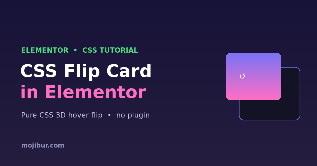
A flip card is a fun, interactive way to show extra information — the card rotates in 3D to reveal a back side on hover. The best part? You can build it in Elementor with pure CSS: no plugin and no JavaScript. This guide gives you the full code, a live demo, and simple ways to customize it.
What you’ll build
A card that smoothly flips to its back face when you hover over it. It works inside any Elementor HTML widget, it’s responsive, and the 3D rotation runs on the GPU so it stays buttery smooth.
Live demo
Hover me
Pure CSS 3D flip — no plugin, no JavaScript. Works anywhere in Elementor.
Step 1 — Add the HTML
Drop an HTML widget where you want the card, and paste this markup. The front is what shows first; the back appears on hover.
					<div class="flip-card">
  <div class="flip-card-inner">
    <div class="flip-card-front">
      <h4>Hover me</h4>
    </div>
    <div class="flip-card-back">
      <p>Your back content here</p>
    </div>
  </div>
</div>
Step 2 — Add the CSS
Add this in Elementor → Site Settings → Custom CSS, or inside the same HTML widget wrapped in a <style> tag.
					.flip-card{
  background: transparent;
  width: 280px;
  height: 200px;
  perspective: 1000px;   /* depth of the 3D effect */
}

.flip-card-inner{
  position: relative;
  width: 100%;
  height: 100%;
  transition: transform 0.7s;
  transform-style: preserve-3d;
}

/* flip on hover */
.flip-card:hover .flip-card-inner{
  transform: rotateY(180deg);
}

.flip-card-front,
.flip-card-back{
  position: absolute;
  inset: 0;
  backface-visibility: hidden;   /* hide the reversed side */
  border-radius: 16px;
  display: flex;
  align-items: center;
  justify-content: center;
}

.flip-card-front{
  background: linear-gradient(135deg,#7873f5,#ff6ec4);
  color: #fff;
}

.flip-card-back{
  background: #141225;
  color: #f2f1ff;
  transform: rotateY(180deg);   /* pre-rotate the back */
}
How it works
The outer .flip-card sets a perspective, which gives the 3D depth. The .flip-card-inner holds both faces and uses transform-style: preserve-3d so children keep their 3D positions. On hover we rotate the inner wrapper 180deg. Each face uses backface-visibility: hidden so only the side facing you is visible, and the back is pre-rotated 180deg so it reads correctly once flipped.
Customization tips
- Flip direction: use
rotateX(180deg)instead ofrotateYfor a vertical flip. - Speed: change
0.7sin the transition. Lower is snappier. - Size: adjust
widthandheighton.flip-card. - Flip on click (mobile): add a class with JavaScript on tap and target
.flipped .flip-card-innerinstead of:hover. - Colors: restyle
.flip-card-frontand.flip-card-backto match your brand.
FAQ
Does this need Elementor Pro?
No. A free HTML widget plus Site Settings → Custom CSS is all you need.
Why doesn’t it flip on mobile?
Touch devices have no hover. Add a small tap handler that toggles a flipped class and flip on that class instead of :hover.
Can I put a button on the back?
Yes. Any HTML works inside the faces — buttons, images, icons, and links.
Wrapping up
That’s a clean, 3D flip card in Elementor using nothing but CSS. Copy the code, restyle the two faces to fit your brand, and reuse it anywhere. Want more? Explore additional Elementor + CSS tricks on the blog.