


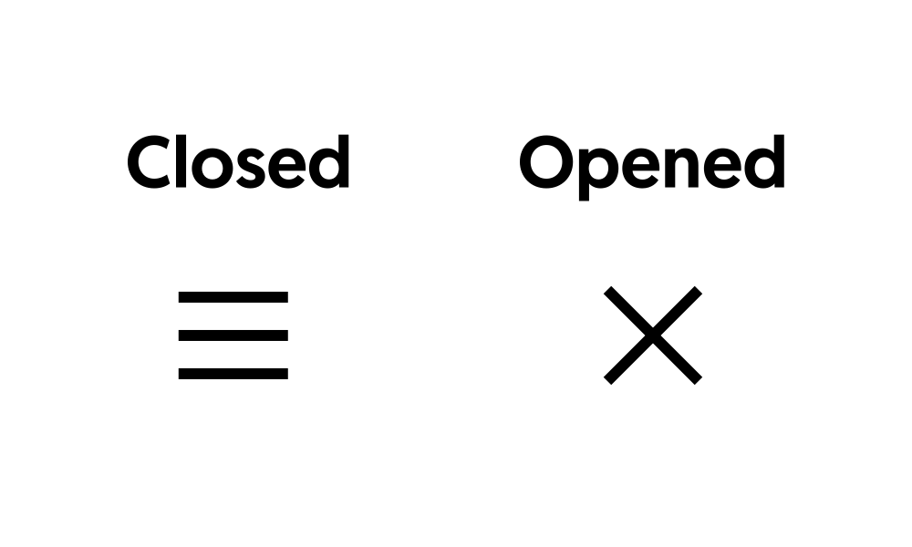
The hamburger icon is the standard trigger for mobile menus, and animating it into an X on click makes your navigation feel polished. This guide shows how to build a responsive, animated hamburger menu in Elementor. Copy the code and match it to your menu.
Animated Hamburger Menu CSS
					selector{
–gap: 0.25em;
–weight: 0.05em;
–width: 0.8em;
}
selector .elementor-menu-toggle{
position: relative;
}
selector .elementor-menu-toggle:before,
selector .elementor-menu-toggle:after,
selector .elementor-menu-toggle i:after{
content: “”;
height: var(–weight);
width: var(–width);
position: absolute;
background: currentColor;
top: 50%;
left: 50%;
transform: translate(-50%,calc(-50% + var(–gap)));
transition: all 0.3s ease-in-out;
}
selector .elementor-menu-toggle.elementor-active:before{
transform: translate(-50%,-50%) rotate(-45deg);
}
selector .elementor-menu-toggle:after{
transform: translate(-50%,calc(-50% – var(–gap)));
}
selector .elementor-menu-toggle.elementor-active:after{
transform: translate(-50%,-50%) rotate(45deg);
}
selector .elementor-menu-toggle i:after{
transform: translate(-50%,-50%);
}
selector .elementor-menu-toggle i:before,
selector .elementor-menu-toggle.elementor-active i:after{
opacity: 0;
}
How it works
The icon is made of three bars, and a CSS transition rotates and repositions them into a cross when an active class is toggled. A small script adds and removes that class on click, while your menu opens and closes alongside it. Everything is lightweight and smooth.
Tips and customization
- Adjust the bar thickness and spacing to taste.
- Change the transition speed for a snappier or softer animation.
- Recolor the bars to match your header.
FAQ
Does this need Elementor Pro?
No. The animated icon is pure CSS and a small script, usable on any plan.
Will it work with my existing menu?
Yes. Connect the toggle class to whichever menu you already use.