


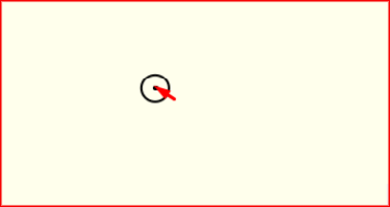
A custom mouse cursor adds a distinctive, modern touch to your website and makes the experience feel more interactive. This tutorial shows how to create a custom cursor effect in Elementor with a little CSS and JavaScript. Copy the code, adjust the size and color, and give your site a unique feel.
Custom Mouse Cursor CSS
					<style>

	.notCursor {
    cursor: none;
  }
  .notCursor * {
    cursor: none;
  }
  #kursorWrapper {
    position: fixed;
    z-index: 99;
    overflow: hidden;
    pointer-events: none;
    top: 0;
    left: 0;
    width: 100%;
    height: 100%;
    overflow: hidden;
  }
  div[class*='kursor'] {
    position: fixed;
    pointer-events: none;
    transform: translate(-50%, -50%);
    z-index: 10000;
  }
  div[class*='kursor'].kursor--hidden {
    opacity: 0;
    width: 0px;
    height: 0px;
  }
  div[class*='kursor'].kursor--1 {
    left: 0px;
    top: 0px;
    width: 25px;
    height: 25px;
    border-radius: 50%;
    border: 2px solid rgba(var(--k-color), 1);
    transition: all 0.2s ease, top 0.18s ease-out, left 0.18s ease-out;
  }
  div[class*='kursor'].kursor--1 + .kursorChild {
    display: block;
    width: 4px;
    height: 4px;
    background: rgba(var(--k-color), 1);
    border-radius: 50%;
    transition: all 0.2s ease, top 0s ease-out, left 0s ease-out;
  }
  div[class*='kursor'].kursor--1.--hover {
    width: 40px;
    height: 40px;
    border: 2px solid rgba(var(--k-color), 0);
    background: rgba(var(--k-color), 0.1);
  }
  div[class*='kursor'].kursor--1.--hover + .kursorChild {
    background: rgba(var(--k-color), 0.3);
  }
  div[class*='kursor'].kursor--1.kursor--down {
    width: 20px;
    height: 20px;
  }
  div[class*='kursor'].kursor--1.kursor--down + .kursorChild:after {
    width: 40px !important;
    height: 40px !important;
    opacity: 0;
    border: 1px solid;
    border-radius: 50%;
    border-color: rgba(var(--k-color), 1);
    transition: all 0.4s ease;
  }
  div[class*='kursor'].kursor--2 {
    left: 0px;
    top: 0px;
    width: 20px;
    height: 20px;
    border-radius: 50%;
    background: rgba(var(--k-color), 1);
    transition: all 0.2s ease, top 0.1s ease-out, left 0.1s ease-out;
  }
  div[class*='kursor'].kursor--2 + .kursorChild {
    display: block;
    width: 4px;
    height: 4px;
    background: rgba(var(--k-color), 1);
    border-radius: 50%;
    transition: all 0.2s ease, top 0.2s ease-out, left 0.2s ease-out;
  }
  div[class*='kursor'].kursor--2.--hover {
    width: 40px;
    height: 40px;
    background: rgba(var(--k-color), 0.1);
  }
  div[class*='kursor'].kursor--2.--hover + .kursorChild {
    background: rgba(var(--k-color), 0.3);
  }
  div[class*='kursor'].kursor--2.kursor--down {
    width: 10px;
    height: 10px;
  }
  div[class*='kursor'].kursor--2.kursor--down + .kursorChild:after {
    width: 40px !important;
    height: 40px !important;
    opacity: 0;
    border: 1px solid;
    border-radius: 50%;
    border-color: rgba(var(--k-color), 1);
    transition: all 0.4s ease;
  }
  div[class*='kursor'].kursor--3 {
    left: 0px;
    top: 0px;
    width: 20px;
    height: 20px;
    border: 1px solid rgba(var(--k-color), 1);
    transition: all 0.2s ease, top 0.05s ease-out, left 0.05s ease-out;
  }
  div[class*='kursor'].kursor--3 + .kursorChild {
    display: block;
    width: 4px;
    height: 4px;
    background: rgba(var(--k-color), 1);
    transition: all 0.2s ease, top 0.2s ease-out, left 0.2s ease-out;
  }
  div[class*='kursor'].kursor--3.--hover {
    width: 40px;
    height: 40px;
    background: rgba(var(--k-color), 0.1);
    border: 1px solid rgba(var(--k-color), 0);
  }
  div[class*='kursor'].kursor--3.--hover + .kursorChild {
    background: rgba(var(--k-color), 0.3);
  }
  div[class*='kursor'].kursor--3.kursor--down {
    width: 5px;
    height: 5px;
    border: 1px solid rgba(var(--k-color), 0);
  }
  div[class*='kursor'].kursor--3.kursor--down + .kursorChild {
    width: 10px;
    height: 10px;
  }
  div[class*='kursor'].kursor--3.kursor--down + .kursorChild:after {
    width: 40px !important;
    height: 40px !important;
    opacity: 0;
    border: 1px solid;
    border-color: rgba(var(--k-color), 1);
    transition: all 0.4s ease;
  }
  div[class*='kursor'].kursor--4 {
    left: 0px;
    top: 0px;
    width: 50px;
    height: 50px;
    border: 1px solid rgba(var(--k-color), 0.3);
    border-radius: 50%;
    transition: all 0.2s ease, top 0.2s ease-out, left 0.2s ease-out;
  }
  div[class*='kursor'].kursor--4 + .kursorChild {
    display: block;
    width: 6px;
    height: 6px;
    background: rgba(var(--k-color), 1);
    border-radius: 50%;
    transition: all 0.2s ease, top 0.03s ease-out, left 0.03s ease-out;
  }
  div[class*='kursor'].kursor--4.--hover {
    width: 30px;
    height: 30px;
    background: rgba(var(--k-color), 0.1);
    border: 3px solid rgba(var(--k-color), 0);
  }
  div[class*='kursor'].kursor--4.--hover + .kursorChild {
    width: 25px;
    height: 25px;
    background: rgba(var(--k-color), 0.1);
  }
  div[class*='kursor'].kursor--4.kursor--down {
    width: 5px;
    height: 5px;
  }
  div[class*='kursor'].kursor--4.kursor--down + .kursorChild {
    width: 10px;
    height: 10px;
  }
  div[class*='kursor'].kursor--4.kursor--down + .kursorChild:after {
    width: 40px !important;
    height: 40px !important;
    opacity: 0;
    border-radius: 50%;
    border: 1px solid;
    border-color: rgba(var(--k-color), 1);
    transition: all 0.4s ease;
  }
  div[class*='kursor'].kursor--5 {
    left: 0px;
    top: 0px;
    width: 10px;
    height: 10px;
    border: 1px solid rgba(var(--k-color), 0.5);
    border-radius: 50%;
    transition: all 0.2s ease, top 0.2s ease-out, left 0.2s ease-out;
  }
  div[class*='kursor'].kursor--5.--hover {
    width: 26px;
    height: 26px;
    background: rgba(var(--k-color), 0.1);
    border: 3px solid rgba(var(--k-color), 0);
  }
  div[class*='kursor'].kursor--5.kursor--down {
    width: 15px;
    height: 15px;
  }
  div[class*='kursorChild'] {
    position: fixed;
    pointer-events: none;
    transform: translate(-50%, -50%);
    display: none;
    overflow: hidden;
  }
  div[class*='kursorChild'].kursorChild[class*='--hidden'] {
    opacity: 0;
    width: 0px;
    height: 0px;
  }
  div[class*='kursorChild'].kursorChild:after {
    content: '';
    pointer-events: none;
    width: 0px;
    height: 0px;
    position: absolute;
    left: 50%;
    top: 50%;
    opacity: 1;
    border: 0px solid rgba(var(--k-color), 0.5);
    transform: translate(-50%, -50%);
  }
  .kursor--absolute {
    position: absolute !important;
    z-index: 2000;
  }
  @media screen and (max-width: 768px) {
    .notCursor * {
      cursor: auto;
    }
    div[class*='kursor'] {
      display: none !important;
    }
    div[class*='kursorChild'] {
      display: none !important;
    }
  }
  @media screen and (max-width: 812px) and (max-height: 430px) and (orientation: landscape) {
    div[class*='kursor'] {
      display: none !important;
    }
    div[class*='kursorChild'] {
      display: none !important;
    }
    .notCursor * {
      cursor: auto;
    }
  }
</style>
Custom Mouse Cursor JS
					<script src="https://unpkg.com/kursor"></script>
<script>
new kursor({
type: 1,
color: '#000000',
removeDefaultCursor: false,
})
</script>
How it works
A small element follows the mouse position using JavaScript, replacing or trailing the default pointer. CSS controls its shape, size, blend mode, and how it reacts on hover over links and buttons. Because it tracks pointer coordinates directly, the movement stays fluid.
Tips and customization
- Change the cursor size and color to match your theme.
- Add a grow effect when hovering over links.
- Use mix blend mode for a striking inverted look.
FAQ
Does it work on mobile?
Custom cursors are a desktop feature, since touch devices have no pointer. It simply does nothing on mobile.
Does it need a plugin?
No. A short script and some CSS are enough.