


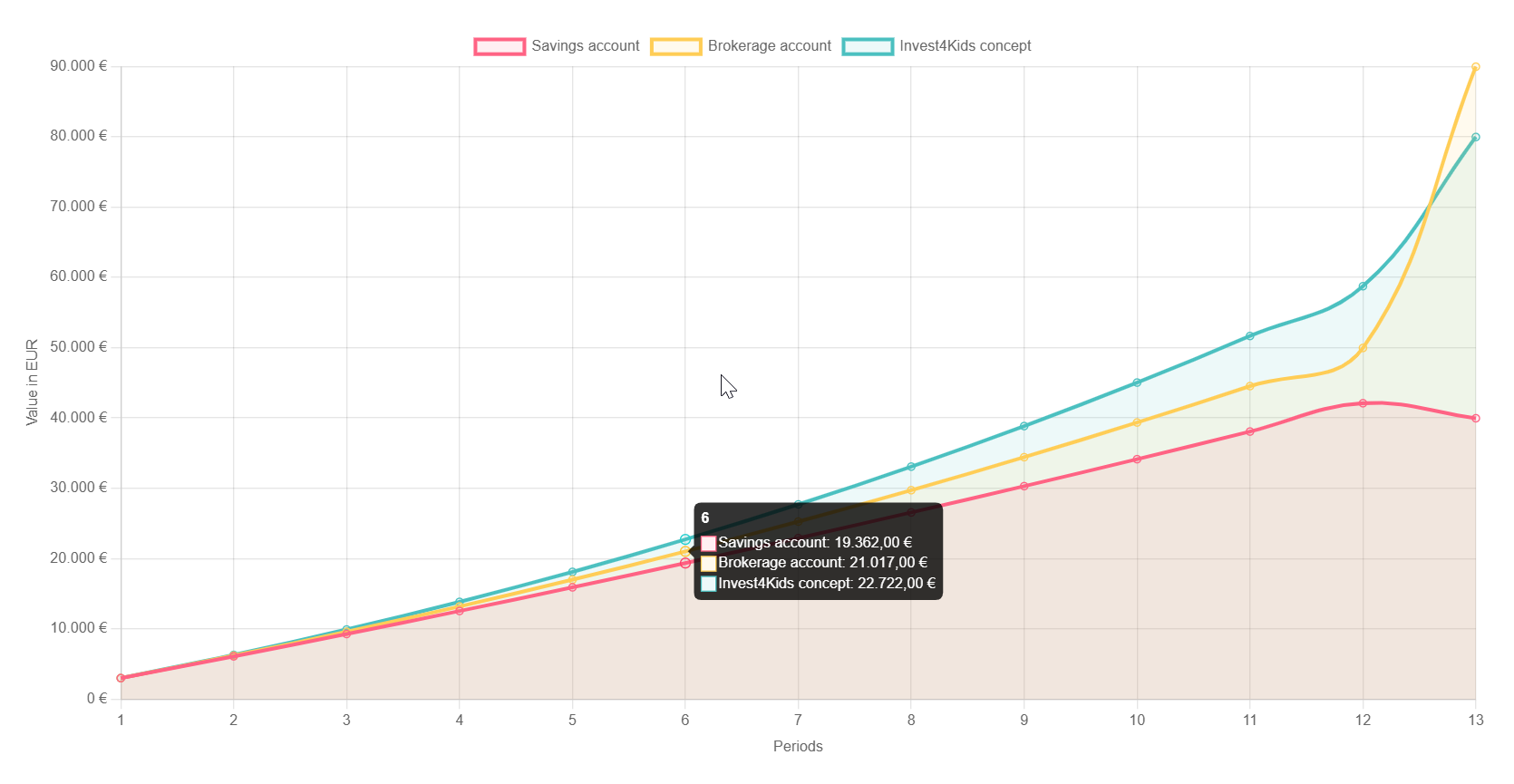
An interactive investment chart helps visitors visualize growth and compare returns at a glance. This guide shows how to add one in Elementor using JavaScript and HTML. Copy the code and plug in your own numbers to bring your finance pages to life.
In this post, I’ll show you how to add an interactive investment chart to your Elementor pages using simple JavaScript and HTML. The code snippet below lets you visualize returns, compare values over time, and easily customize the chart to match your website’s style—without needing a complex plugin.
Live example
Investment Chart HTML
					<div style="width: 100%; max-width: 1200px; margin: 0 auto; font-family: Arial, sans-serif;">
    <h2 style="text-align: center; color: #1a365d; margin-bottom: 2rem;">
        Calculation Example: Child Benefit with a 250€ Savings Rate
    </h2>

    <canvas id="investmentChart"></canvas>
</div>
Investment Chart JavaScript
					<!-- Include Chart.js from CDN -->
<script data-minify="1" src="https://mojibur.com/wp-content/cache/min/1/npm/chart.js?ver=1790750105"></script>

<script>
let chart;

function initializeChart() {
    const ctx = document.getElementById('investmentChart').getContext('2d');
    chart = new Chart(ctx, {
        type: 'line',
        data: {
            labels: [],
            datasets: [
                {
                    label: 'Savings account',
                    data: [],
                    borderColor: 'rgb(255, 99, 132)',
                    backgroundColor: 'rgba(255, 99, 132, 0.1)',
                    fill: true,
                    tension: 0.4
                },
                {
                    label: 'Brokerage account',
                    data: [],
                    borderColor: 'rgb(255, 205, 86)',
                    backgroundColor: 'rgba(255, 205, 86, 0.1)',
                    fill: true,
                    tension: 0.4
                },
                {
                    label: 'Invest4Kids concept',
                    data: [],
                    borderColor: 'rgb(75, 192, 192)',
                    backgroundColor: 'rgba(75, 192, 192, 0.1)',
                    fill: true,
                    tension: 0.4
                }
            ]
        },
        options: {
            responsive: true,
            interaction: {
                intersect: false,
                mode: 'index'
            },
            plugins: {
                tooltip: {
                    callbacks: {
                        label: function(context) {
                            let label = context.dataset.label || '';
                            if (label) {
                                label += ': ';
                            }
                            if (context.parsed.y !== null) {
                                label += new Intl.NumberFormat('de-DE', {
                                    style: 'currency',
                                    currency: 'EUR'
                                }).format(context.parsed.y);
                            }
                            return label;
                        }
                    }
                }
            },
            scales: {
                x: {
                    title: {
                        display: true,
                        text: 'Periods'
                    }
                },
                y: {
                    title: {
                        display: true,
                        text: 'Value in EUR'
                    },
                    ticks: {
                        callback: function(value) {
                            return new Intl.NumberFormat('de-DE', {
                                style: 'currency',
                                currency: 'EUR',
                                maximumFractionDigits: 0
                            }).format(value);
                        }
                    }
                }
            }
        }
    });
}

function updateChartData(newData) {
    chart.data.labels = newData.labels;
    chart.data.datasets[0].data = newData.savings;
    chart.data.datasets[1].data = newData.brokerage;
    chart.data.datasets[2].data = newData.invest4Kids;
    chart.update();
}

// Initialize the chart
initializeChart();

// Example of how to update the chart data
function exampleUpdateChart() {
    const newData = {
        labels: ['1', '2', '3', '4', '5', '6', '7', '8', '9', '10', '11', '12',13],
        savings: [3000, 6090, 9270, 12542, 15905, 19362, 22912, 26557, 30297, 34132, 38064, 42092,39952],
        brokerage: [3000, 6195, 9590, 13189, 16996, 21017, 25257, 29722, 34418, 39351, 44527, 49952,89952],
        invest4Kids: [3000, 6300, 9909, 13839, 18105, 22722, 27706, 33073, 38841, 45028, 51652, 58733,79952]
    };
    updateChartData(newData);
}

// Call the example update function after a short delay to show the initial empty chart first
setTimeout(exampleUpdateChart, 1000);
</script>
How it works
A chart script reads your data values and draws bars or lines inside a container, with labels and a legend. HTML holds the container, while the script handles the drawing and any interactivity like tooltips. You update the data to reflect your figures.
Tips and customization
- Feed in your own values to match your scenario.
- Use brand colors for the bars or lines.
- Add tooltips so users can read exact numbers.
FAQ
Does it need a plugin?
No. A charting script embedded through an HTML widget is enough.
Is it responsive?
Yes. Most chart scripts resize to fit the container on any screen.