


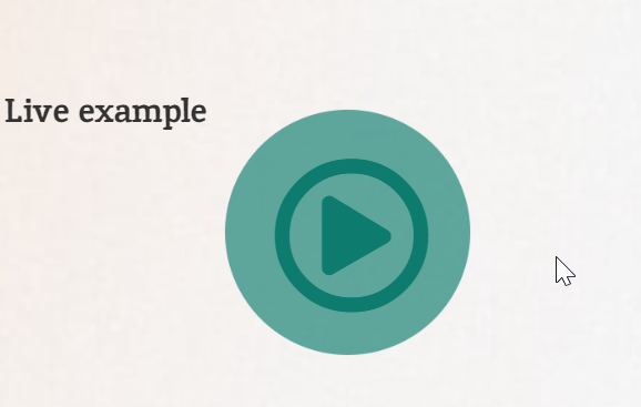
A play button that gently pulses draws the eye straight to your video or audio content. In this tutorial you will build one in Elementor using nothing but CSS, so it stays lightweight and works on any device. Copy the code below, drop it into your page, and adjust the colors to match your brand.
Live example
Paly animation CSS
					.paly-animation-btn::before{
content:"";
width: 90px; height: 90px; position: absolute; top: 0;
left: 0;
background:
#0d7c6e;
border-radius: 50%;
}


.paly-animation-btn::before{

	content:"";
width: 90px; height: 90px;
position: absolute;
top: 0;
left: 0;
background:
#0d7c6e;

border-radius: 50%;
animation: palybtn 1.5s ease-out infinite;
}


@keyframes palybtn{
		0%, 30%{
		transform: scale(0);
		opacity: 1;
	}

50%{
transform: scale(1.5);
opacity: .9;
}
100%{
	transform: scale(2);
opacity: 0;
}


}

.paly-animation-btn:hover::before {

	content:"";
width: 90px; height: 90px;
position: absolute;
top: 0;
left: 0;
background:
#f3bc4d !important;

border-radius: 50%;
animation: palybtn 1.5s ease-out infinite;
}
How it works
The effect relies on a CSS keyframe animation applied to the button. A pseudo element creates the expanding ring behind the icon, while the animation loops the scale and opacity to produce a continuous pulse. Because everything runs through transforms and opacity, the animation stays smooth and adds almost no load time.
Tips and customization
- Change the animation duration to make the pulse faster or slower.
- Swap the ring color to match your accent color.
- Increase the scale value for a wider, more dramatic ripple.
- Pause the animation on hover if you prefer a calmer look.
FAQ
Does this need any plugin?
No. It is pure CSS, so it works in any Elementor page through a custom CSS box or the Site Settings CSS.
Will it slow my site down?
No. The animation uses only transform and opacity, which are cheap for the browser to render.