


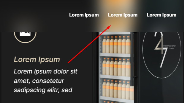
The glassmorphism, or glassy, effect gives cards and sections a frosted, semi transparent look that feels modern and premium. This guide shows how to create it in Elementor with a few lines of CSS. Copy the code and apply it to any container.
Header sticky Glassy effect CSS
					selector.elementor-sticky–effects{
backdrop-filter: saturate(180%) blur(20px);
-webkit-backdrop-filter: saturate(180%) blur(20px);
}
Container Glassy effect CSS
					selector{
backdrop-filter: saturate(180%) blur(20px);
-webkit-backdrop-filter: saturate(180%) blur(20px);
}
Glassy effect background image CSS
					selector::before {
background-color: rgba(249, 249, 251, 0.80);
backdrop-filter: blur(15px);
-webkit-backdrop-filter: blur(15px);
}
How it works
The effect combines a semi transparent background with a backdrop blur filter, so whatever sits behind the element appears frosted. A soft border and subtle shadow complete the glass look. Because it uses native CSS filters, it stays lightweight.
Tips and customization
- Increase the blur amount for a stronger frosted look.
- Lower the background opacity to let more of the backdrop show.
- Add a light border to enhance the glass edge.
FAQ
Does it work in all browsers?
Backdrop blur is supported in all modern browsers. Older ones simply show the semi transparent background.
Do I need an image behind it?
It looks best over an image or colorful background, since the blur has something to frost.