
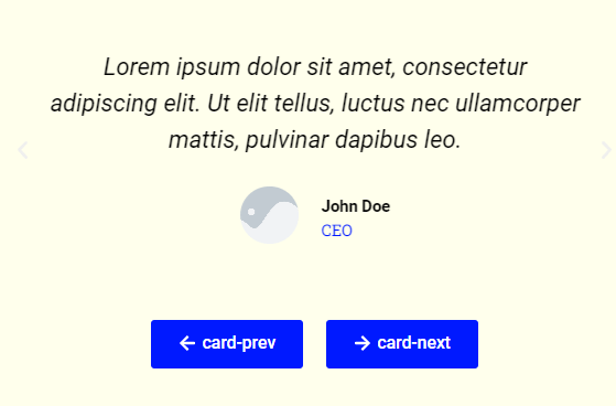
Default slider arrows and dots do not always match your design. Customizing the slider or carousel buttons in Elementor lets you create controls that fit your brand perfectly. This guide shows how to style them with a little CSS.
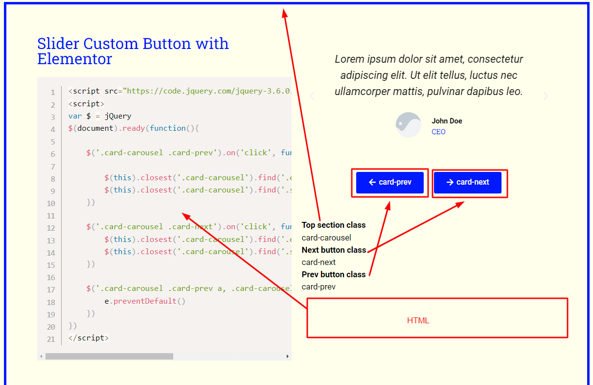
JavaScript code snippet for Left/Right Navigation:
Top section class
card-carousel
Next button class
card-next
Prev button class
card-prev
Live Preview
How it works
The slider generates navigation elements such as arrows and dots that you can target with CSS. By adjusting their size, color, position, and hover state, you turn the default controls into custom buttons. The slider behavior stays the same while the look becomes yours.
Tips and customization
- Recolor arrows and dots to match your palette.
- Increase the click area for easier tapping on mobile.
- Add a hover effect for better feedback.
FAQ
Does this change how the slider works?
No. It only restyles the controls. The sliding behavior is untouched.
Do I need Pro?
It depends on the slider widget, but the CSS styling itself works on any plan.